Translate

jeudi 7 août 2014

EVOLUTION OF MY LOGO


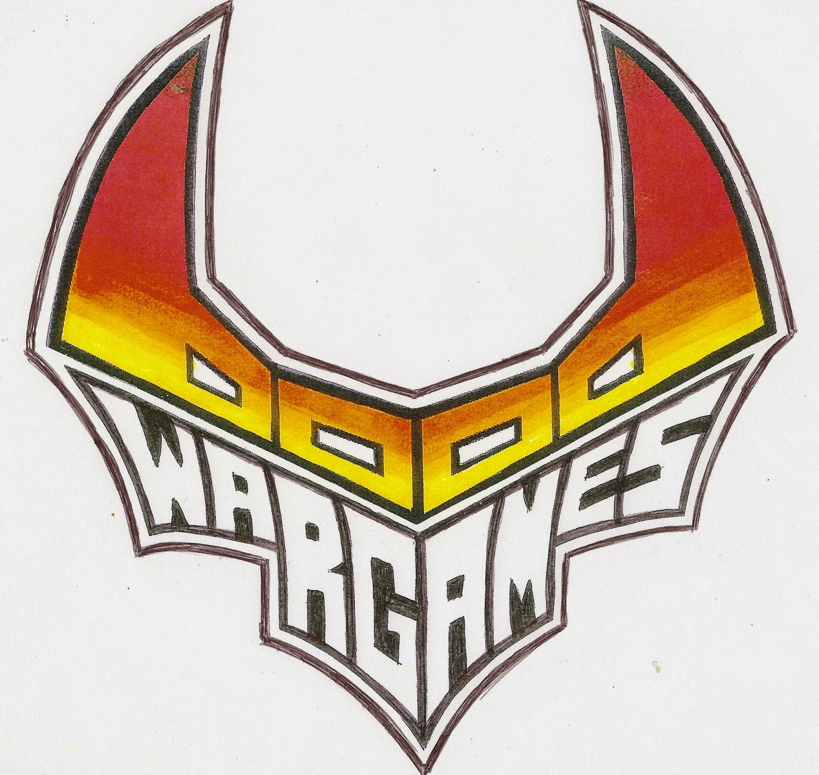
                      when I made this logo I thought I had finished, and I do not think it's not  finally readable enough and I think a logo should be larger than higher


                   So I tried to make it more readable and I found not so bad! ( finally I love but apparently almost everyone preferred the preceding )


                                                                                                                 Alternatively

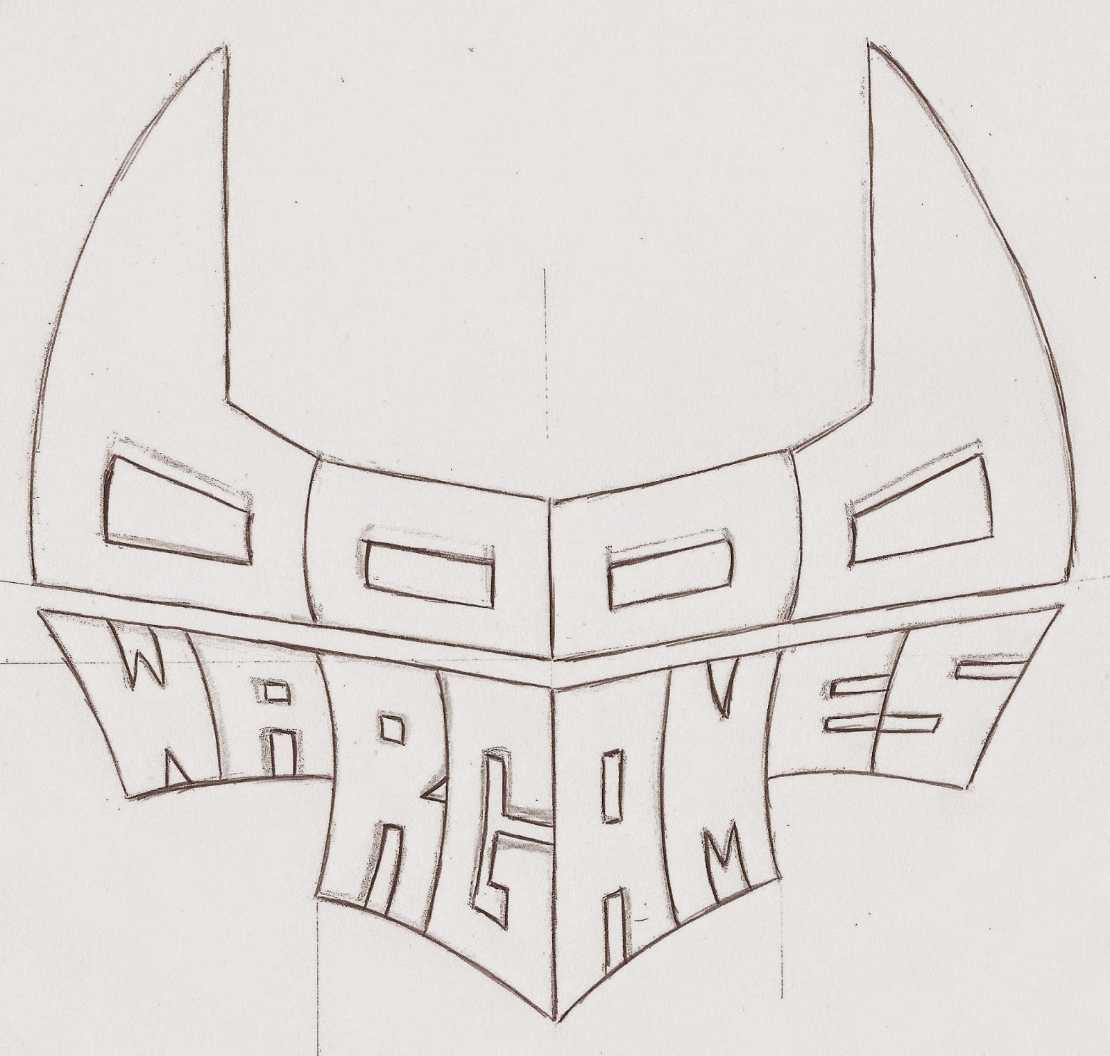
                                                                                          I tried to make it even wider and less high


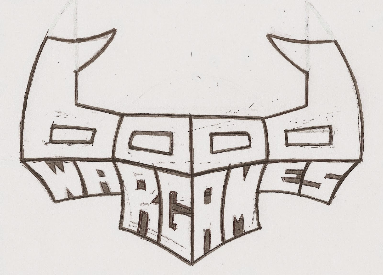
                                                                                              and even broader and less high


                                                                                                                  Alternatively


                                                                                                                 Alternatively


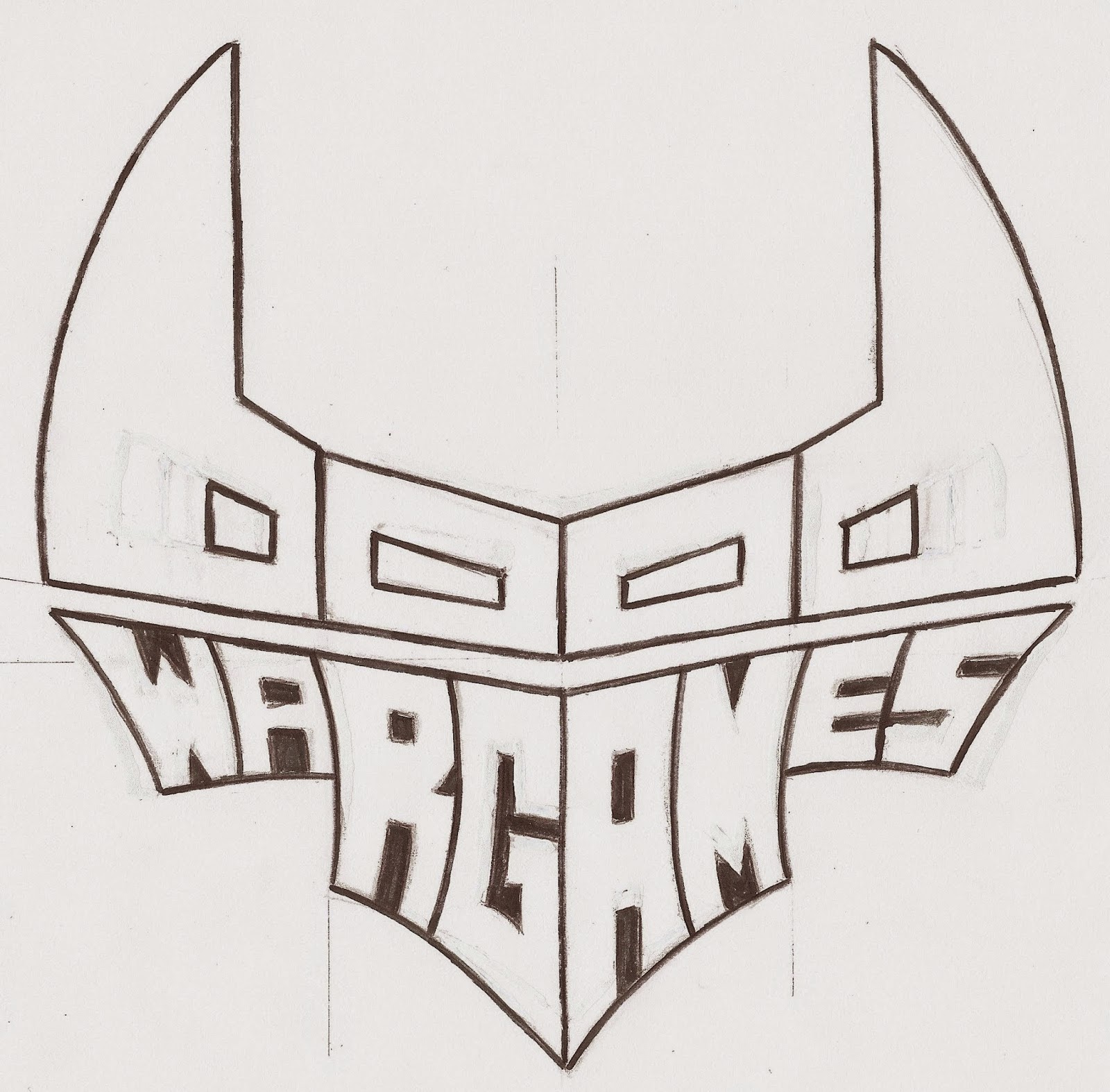
             And finally the mixture of my two favorite !!! ( the first two drawing I think I'll keep this one I'll post shortly more finished drawings like the first

Aucun commentaire:

Enregistrer un commentaire